Design for AI Builders: A Practical Guide from Component to Launch
Based on our virtual event with Simon Bergeron, front-end designer and founder of Lemonbrand.
Most non-technical founders building with AI face the same frustration: their products work, but they look... templated. That's exactly what Simon Bergeron, a front-end designer with 10 years of experience, addressed in our recent office hours session.
Simon's been building on the web since the WordPress days of 2010, evolving through Gatsby, React, and now AI-native tools. His approach? Design isn't just about making things pretty—it's about creating consistent, purposeful systems that AI can work with, as well as deciding what message do you want to convey.
AI Sucks at Components
Let me be blunt about this: AI is terrible at component architecture. It wants to generate everything in one massive block of code, which is the worst possible approach for maintainable design.
Simon typically would give the AI a basic library, and then adds onto it by telling it, 'I want you to modify the timing with regards to this' or 'modify the look of this'—instead of trying to say, 'hey, build the entire component.'
Professional designers and developers work by subdividing complex things into reusable pieces. Simon's typical React structure looks like this:
• Container level - The main wrapper
• Feature components - Major sections
• Sub-components within features - Smaller, reusable pieces called multiple times
"I'm going to have my features, then I'm going to have components as secondary and tertiary elements within those features," Simon explains, showing his skeleton component—a basic grid with consistently styled titles, plus different skeleton variations as separate React components.
Give AI your pre-defined component library and ask it to modify specific pieces, not rebuild everything from scratch. This leverages what AI is good at (modifications) while avoiding what it's terrible at (complex component architecture).
AI tries to rebuild everything from scratch every time. Instead of trying to share your entire screen and have an AI one-shot a replica, you need to build things in building blocks and then modify them.
Atomic Design
• Typography (fonts, sizes, hierarchy)
• Colors (3 primary colors plus neutrals)
• Aesthetic (your overall vibe)
One critical insight: never use pure black (#000000) or pure white (#FFFFFF). They create harsh contrast that screams "template." Instead, tint your whites and blacks slightly toward your primary color.
For color palettes, Simon recommends keeping it simple:
• One primary color
• Off-white (slightly tinted toward your primary)
• Off-black (same approach)
• Then add your neutrals (nine shades from 100-900)
• State colors for UI (success green, warning yellow, error red)
The 8-Point System
Designers hate working with 10s. Why? Because dividing 10 gives you 5, and 5 is an annoying number to work with in design systems.
If I divide an 8 in half, regardless of how many times I do it, it always comes out to twos. Much easier to work with from a developer standpoint.
What "spacing" means: This is the breathing room in your design—the padding inside elements (like the space between a button's edge and its text), the margins between elements (like the gap between a form field and the next one), and the overall gaps in your layouts. It's what makes your design feel organized rather than cramped or chaotic.
This means all your padding, margins, element sizing, and layout gaps should follow this system:
• Minimum: 8px
• Half size: 4px
• Quarter: 2px
• Large sizes: multiples of 8 (64, 128, 256)
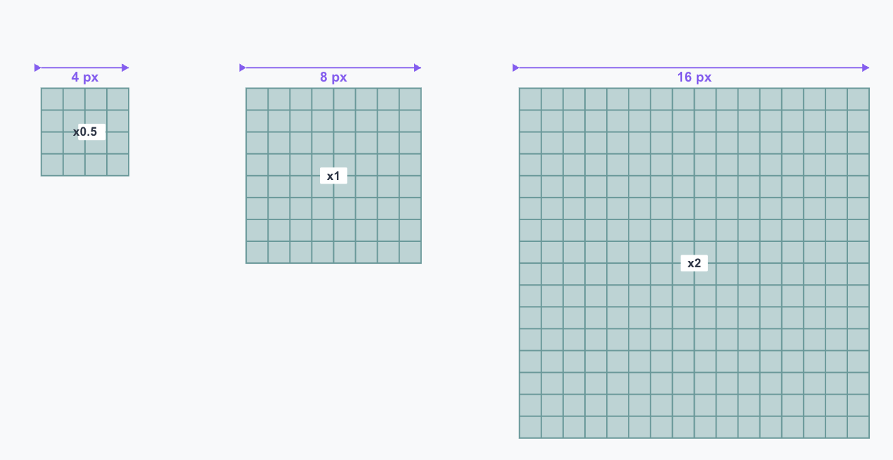
Why this matters: When you're working with AI to build components, consistent spacing makes everything align naturally. Your buttons, form fields, cards, and containers all snap to the same grid. If you need a big heading? Start with 64px or 128px. Need tight spacing between an icon and text? Use 4px. Everything divides cleanly, and AI can maintain this consistency across your entire application.
It's one of those principles that seems small but makes a massive difference in how professional your design feels—and how well AI can maintain it.
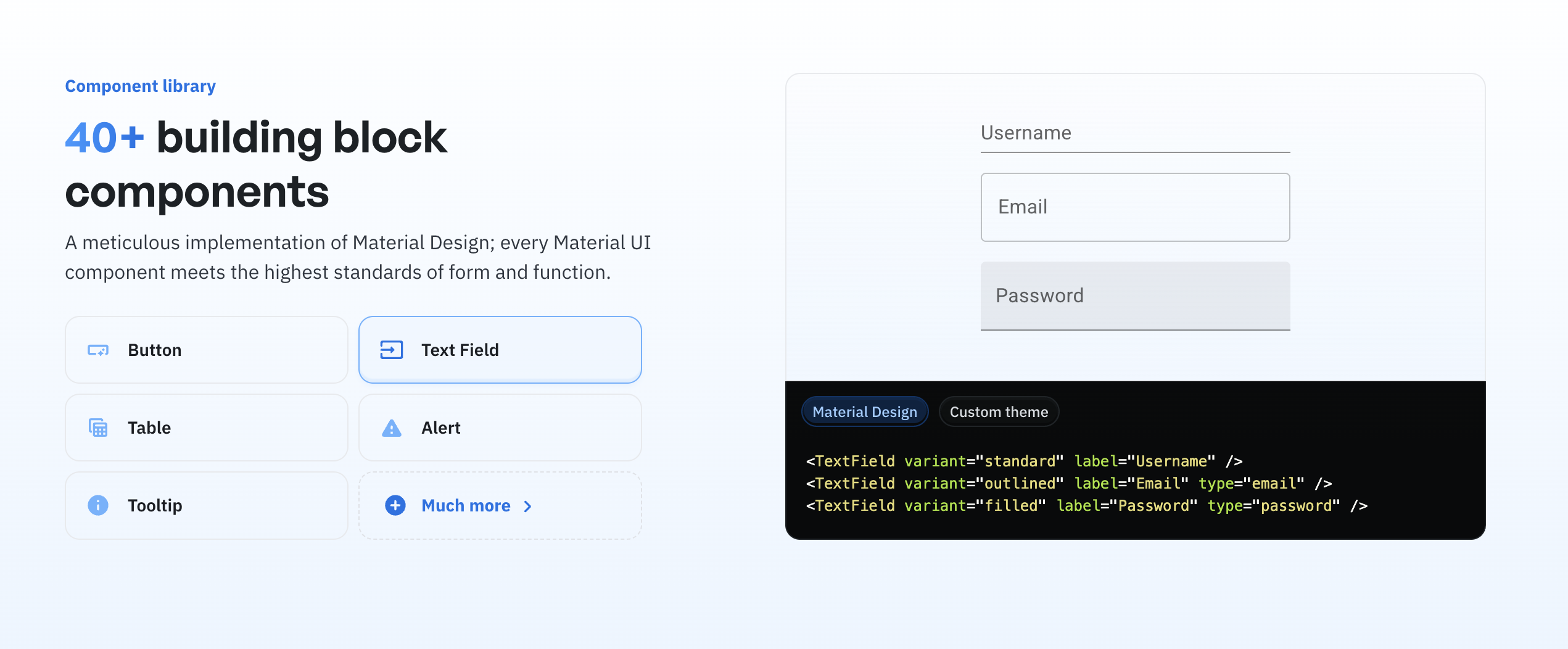
The Four Essential Components
• Text fields
• Buttons
• Loading/progress bars
• Selectors
Everything else builds from these. And once you define them, stay consistent. Your search text box and your form text box should feel identical.
Consistency is what makes or breaks your design. If you start giving AI different styles every time you want to do something, that's what really breaks it.
Choosing Your Design Stack
Simon recommends starting with established libraries:
• Material-UI - Extremely good base components
• shadcn/ui - Popular but creates sameness (everyone's using it)
For Design Systems
"If you go into Figma and search for libraries, you'll find tons of free UI kits that already have everything defined," Simon explains, demonstrating with an iOS UI kit search.
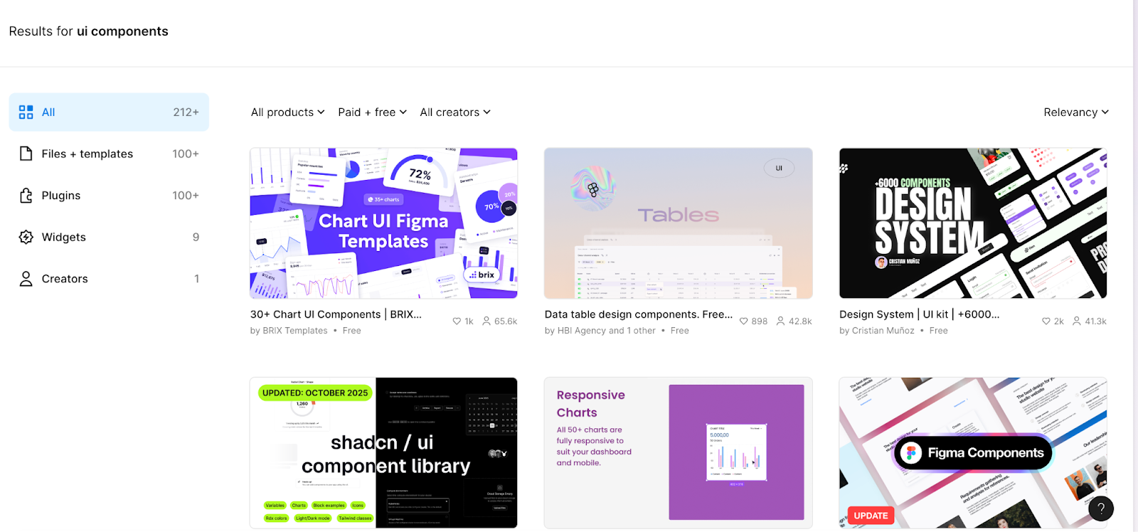
These Figma UI kits are valuable because they're already built with proper component structure:
• Typography hierarchies are defined (H1s down to H6, paragraph text, bold, semi-bold)
• Color systems include the full range of neutrals (100-900)
• State colors for UI are standardized
• All the baseline components (buttons, text fields, selectors) are ready to use
Simon's workflow: Download a UI kit you like from Figma (either free or paid), then provide it to AI as context. "These are all properly defined. If I go into dev mode, I've got my display properties, my padding is consistent—everything you need is already there."
This approach gives you a professional foundation without reinventing the wheel, while still allowing you to customize colors, typography, and interactions to make it your own. You get the structure that AI needs to work well, plus a starting point that doesn't look like every other shadcn project.
Your 30-Minute Design Foundation
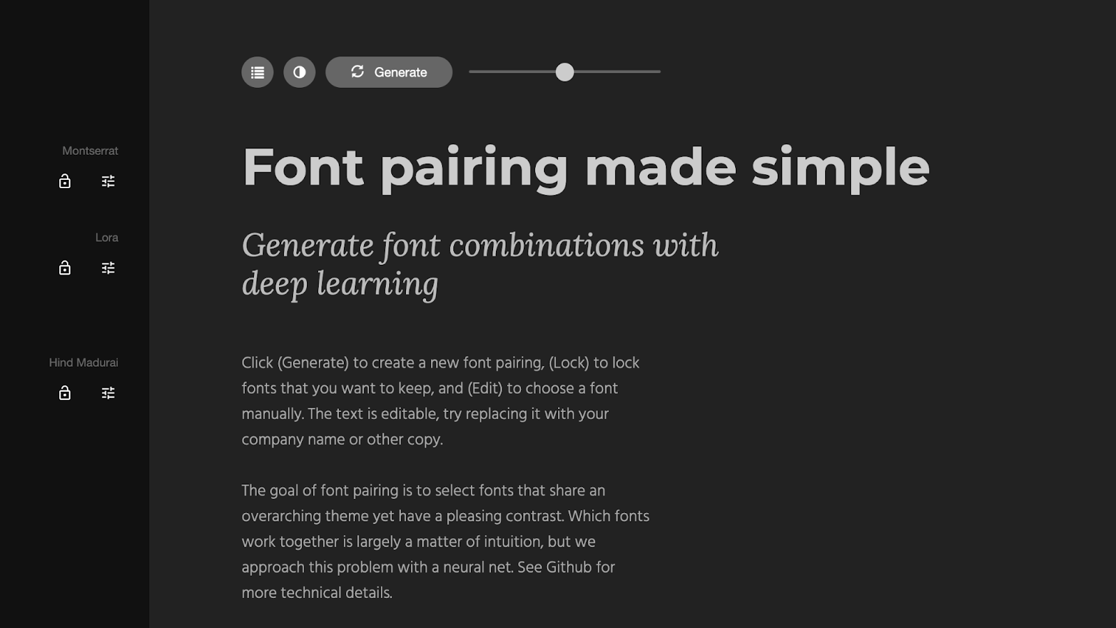
Typography First - Use Fontjoy to find pairings
• Choose a heading font with personality
• Choose a body font prioritizing legibility
• Lock what you like and keep generating
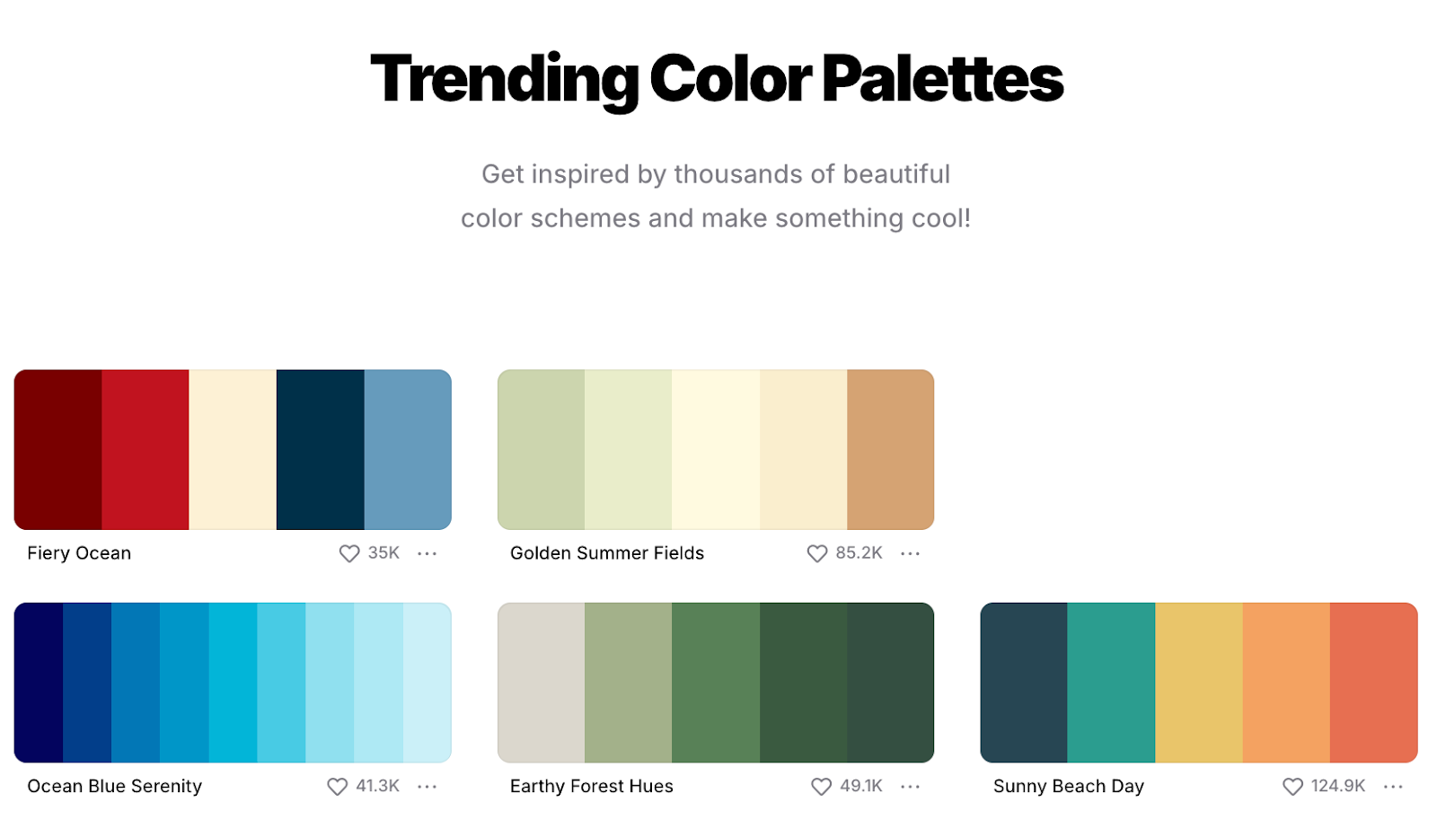
Colors Second - Use Coolors
• Generate palettes or browse trending ones
• Remember: you're choosing five color curves, not five colors
• Each has shades, so it's really ~500 colors
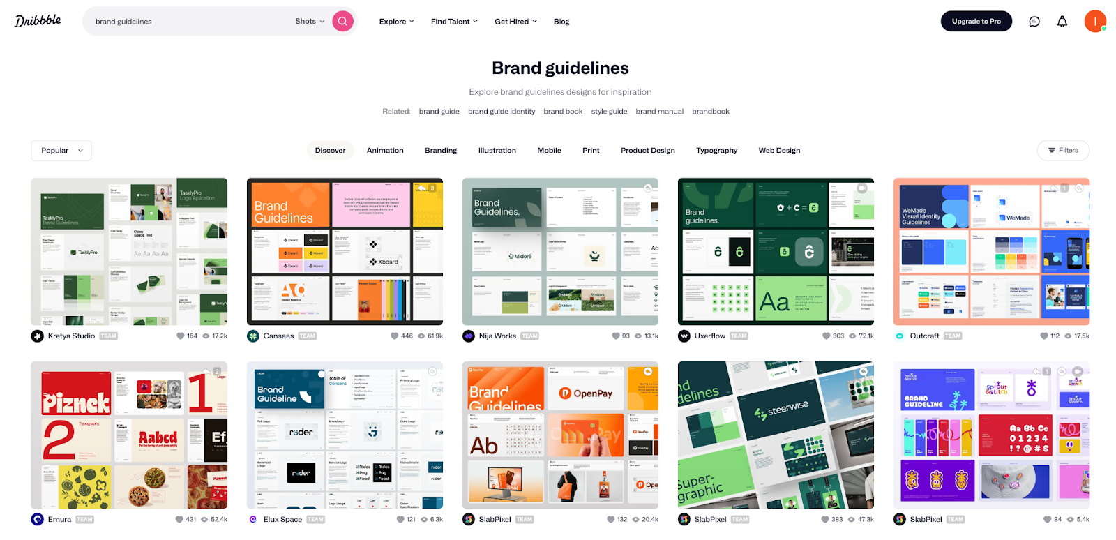
Aesthetic Third - Use Dribbble
• Search "brand identity" or "brand guidelines"
• Find portfolios that match your vibe
• Choose a design style (brutalist, modern, funky, etc.)
• Use Unsplash to find images matching that aesthetic
• Pro tip: Use Unsplash's image recognition search—if you like a cement/brutalist style, search "cement" and find photos that reinforce your chosen direction
"What I'm doing here is defining what direction my application is going to take," Simon explains. "This is human work—me defining the aesthetic. Then I feed all these elements into Gemini or Claude and say, 'Let's define the brand voice that comes with this.'"
The key insight? You're working on the "PRD version of design work" before touching any code. Design is psychology—your aesthetic defines how users interact with your product and what tone of voice they expect from you.
Working with Figma (If You Hire a Designer)
A good Figma designer isn't drawing on a canvas—they're defining code:
• Proper auto-layouts
• Defined variables
• Consistent component structures
• All spacing and sizing properly set
"If your designer is treating Figma like Photoshop, they're not going to work well with AI tools," Simon warns. "Figma is very much a designer tool—you're defining exactly what the code should be."
Figma's MCP (Model Context Protocol) server is getting better at this integration, but you need a designer who understands component-driven design.
The Secret Sauce: Micro-interactions
"What gives life to any application is when you hover over an object, what happens to it?" Simon demonstrates with his own project—a website where elements don't just appear, they slightly fade in with carefully timed easing.

The 12 Principles of Animation aren't new—they're from Disney's golden age. But AI doesn't understand them yet because "it only sees code, not the canvas."
Simon's approach:
• Find React examples of interactions you like (he recommends Aceternity)
• Copy the component code
• Tell AI to use this as a base, not rebuild it
"Instead of trying to describe an interaction to AI, show it working code and ask it to modify that."
Can AI Help You Describe Interactions?
Simon pointed to 21st.dev as an example of a tool trying to solve exactly this—craft AI UI components from visual references.
"As a designer, I like it. I do find it's expensive though—I eat up my tokens very quickly," Simon notes. "That's why I don't recommend it yet. When there are so many free resources available, the cost doesn't justify it."
The fundamental issue? "There's a lot of hidden logic behind animations that don't necessarily translate well. You're seeing the video component, but you're not seeing all the work that goes behind the scenes."
His recommendation remains: find working React examples and adapt them rather than trying to describe interactions from scratch.
The Reality Check on Gen AI
Use it for:
• Mockups and disposable content
• Advertisements (with disclosure)
• Exploring concepts
Don't use it for:
• Brand identity
• Final production assets
• Anything requiring precise control
"There are 12 million assets in Icon Scout alone. With so many good libraries available, why use AI that gives you unpredictable SVGs?"
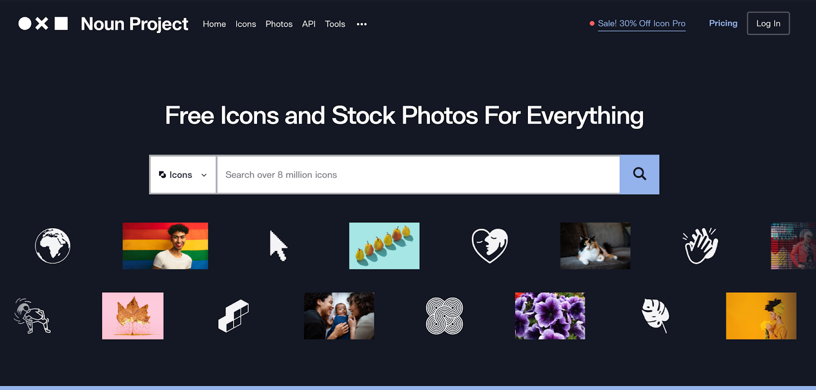
For icons specifically, Simon uses Noun Project and Icon Scout, filtering for SVG format since they're easier to animate than PNGs.
The Component-First Workflow
• Audit what you have - Ask AI to identify all buttons, text inputs, cards
• Define your base components - Create one version of each element
• Replace systematically - Tell AI to swap all instances with your components
• Test consistency - Make one change and verify it applies everywhere
"If you already have a working prototype and want to start updating it, my approach is to start defining buttons properly and then tell AI to replace them," Simon advises.
This saves massive amounts of tokens. Every time AI rewrites code from scratch, you're burning money.
The Tools Simon Actually Uses
• Figma (component libraries and MCP integration)
• Cursor (for code)
• Claude Code (for implementation)
• Material-UI or shadcn/ui (as bases)
For Resources:
• Fontjoy (typography pairings)
• Coolors (color palettes)
• Dribbble (aesthetic inspiration)
• Unsplash (photography matching your aesthetic)
• Noun Project / Icon Scout (icons)
• Aceternity (interaction examples)
For Experiments:
• 21st.dev (AI component generation from visuals, but expensive)
The Bottom Line
Design is a promise. It's a promise of an aesthetic, of a feeling, of a way of thinking. You need to follow through with that promise throughout your entire product.
The key isn't hiring a designer on day one. It's understanding the fundamentals:
• Work component-first
• Stay consistent
• Use the 8-point system
• Choose your fonts, colors, and aesthetic deliberately
• Find good examples and adapt them rather than generating from scratch
"Spend an hour defining your design system before you write a line of code. Then feed that to your AI tools. That's what makes the difference between looking like everyone else and having something that feels like yours."
Want to learn more about building with AI? Join our community of vibe coders and non-technical founders at Differ. We're building the code storage and collaboration platform that actually speaks your language.