Vibe Coding
Design Tips for your Vibe Coded Project
undefined
You've built something real with Cursor or Claude. The functionality works, the logic is solid, and you're genuinely proud of what you've created. But there's a problem: it looks AI-generated. You know the aesthetic—the purple-blue gradient background, the rounded corners on everything, the shadcn/ui components used exactly as they come. It's the visual equivalent of Comic Sans: instantly recognizable, and not in a good way. Here's the thing: the gap between "this works" and "this looks professional" is smaller than you think. You don't need to become a designer. You need to know which details matter, which tools to use, and where to look for inspiration.
The "Vibe Coded" Tell: What Gives It Away?
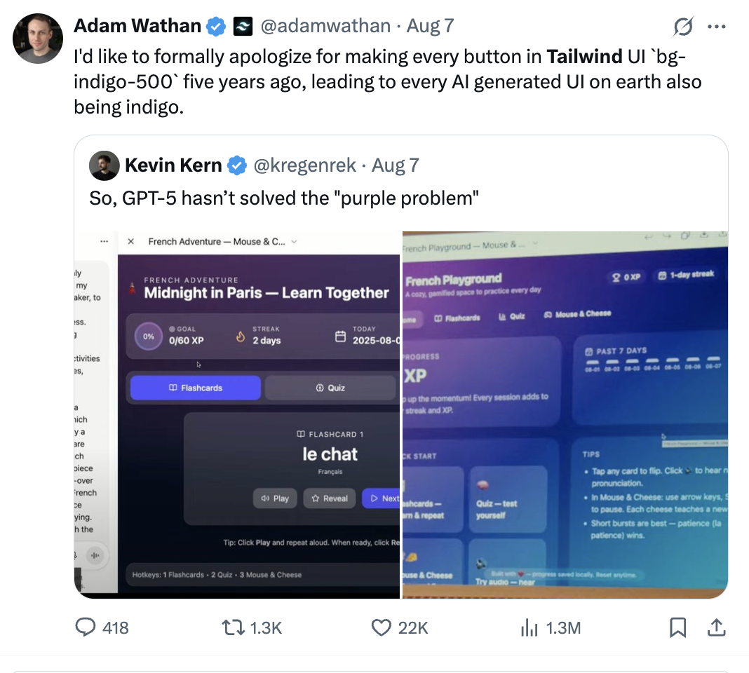
Before we fix it, let's diagnose it. AI-generated sites typically share these characteristics:
• The gradient: Purple fading to blue, or that teal-to-purple combo that screams "I used the first Tailwind gradient example"
• Default component styling: shadcn/ui or Radix components with zero customization
• Uniform spacing: Everything is p-4 or gap-6 with no variation or breathing room
• Generic animations: Fade-ins only, or the same slide-up animation everywhere
• No personality: It works, but it could be for any product in any industry
The goal isn't to hide that you used AI tools—it's to add the layer of intentionality that shows you care about the final product.
1. Use Premium Component Libraries (Not Just shadcn/ui)
Make no mistake, shadcn/ui is excellent. But when everyone uses the same components with the same styling, everything starts looking identical.
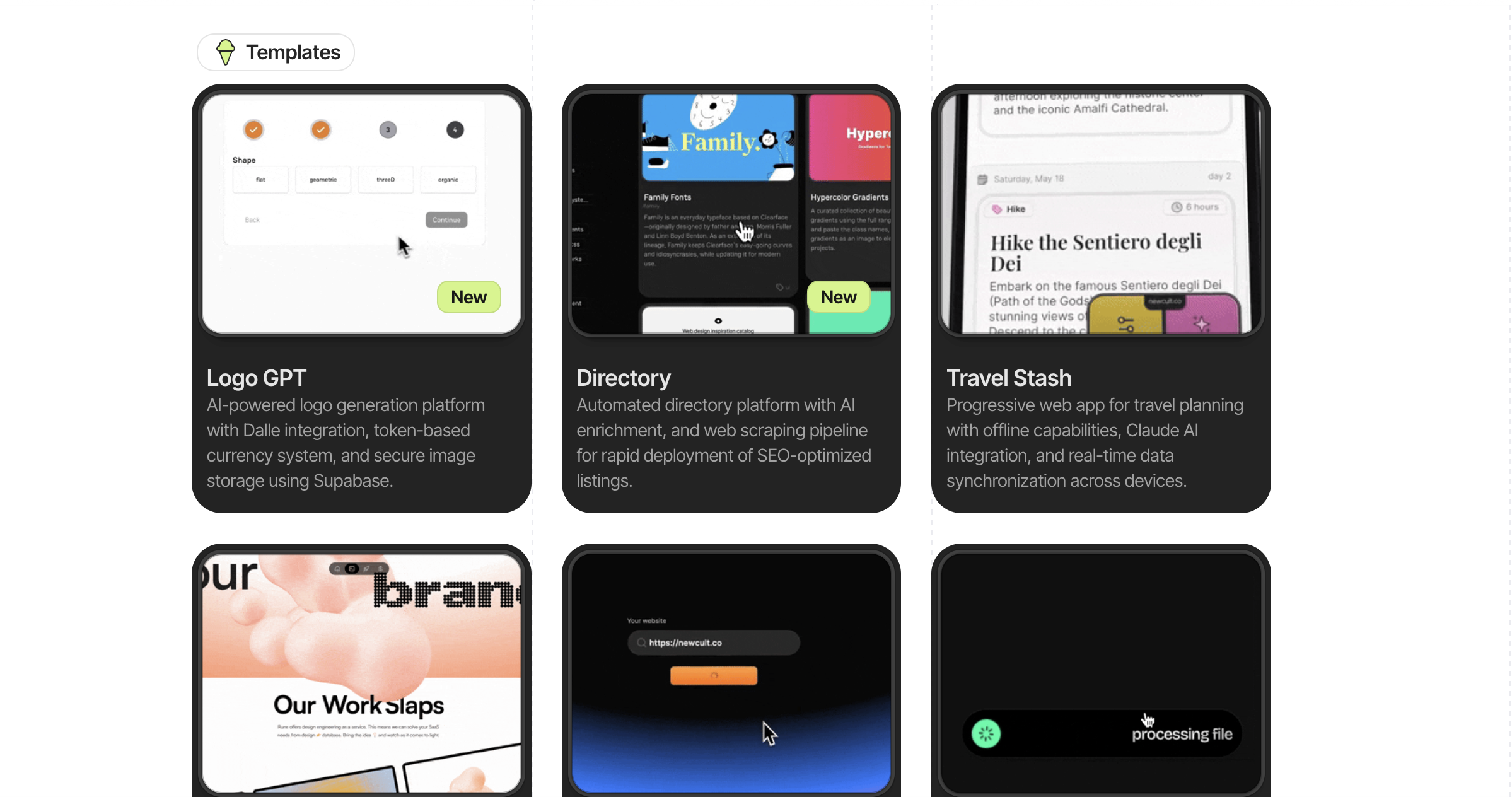
Explore premium component libraries:
• Aceternity UI - Beautiful, modern components with built-in animations and sophisticated interactions. Features Bento Grid layouts, animated backgrounds (grid patterns, aurora effects), and premium card hover effects.
• Magic UI - Animated components specifically designed for landing pages with smooth, eye-catching transitions.
• DaisyUI - A massive library of Tailwind CSS components with multiple themes built-in. Great for rapid prototyping with a more playful, approachable aesthetic.
• Cult UI - More experimental and editorial-style components for projects that need a unique, artistic feel.
• Park UI - Clean, subdued, and professional components for more traditional or corporate projects.
The key with any of these: customize the colors and spacing to match your brand. Don't use them straight out of the box. The goal is to use these as a foundation, not a final product. Change the color palette, adjust the spacing, modify the animation timing—make them yours.
2. Master Micro-Interactions (The 1% Details That Matter)
This is where professional design lives: in the details most people don't consciously notice but everyone feels.
Micro-interactions are the small animations and feedback loops that happen when users interact with your site. A button that slightly scales down when clicked. A card that lifts on hover. A navigation bar that subtly changes as you scroll.
These tiny details compound. One micro-interaction might seem trivial, but when applied consistently across your entire site, they create a sense of polish and intentionality that separates shipped products from prototypes.
The good news? You can literally prompt for these. Instead of asking your AI tool to "make a button," try: "Create a button with a scale-down effect on click, a subtle lift on hover, and a 150ms transition." The more specific you are about the interaction you want, the better the output.
Examples of Micro-Interactions Worth Adding:
• Button press states: Add
• Hover states with purpose: Instead of just changing color, try
• Scroll-triggered effects: Navigation bars that add a subtle shadow or backdrop blur when scrolling
• Loading states: Replace generic spinners with skeleton screens using Skeleton UI patterns
• Stagger animations: Use Framer Motion to stagger list items so they don't all appear simultaneously
The key principle: micro-interactions should feel responsive and natural, never slow or janky. Aim for animations between 150-300ms for most interactions. Anything slower starts to feel sluggish.
Micro-interactions are the small animations and feedback loops that happen when users interact with your site. A button that slightly scales down when clicked. A card that lifts on hover. A navigation bar that subtly changes as you scroll.
These tiny details compound. One micro-interaction might seem trivial, but when applied consistently across your entire site, they create a sense of polish and intentionality that separates shipped products from prototypes.
The good news? You can literally prompt for these. Instead of asking your AI tool to "make a button," try: "Create a button with a scale-down effect on click, a subtle lift on hover, and a 150ms transition." The more specific you are about the interaction you want, the better the output.
Examples of Micro-Interactions Worth Adding:
• Button press states: Add
active:scale-[0.98] to buttons so they feel physically responsive• Hover states with purpose: Instead of just changing color, try
hover:translate-y-[-2px] with a subtle shadow increase• Scroll-triggered effects: Navigation bars that add a subtle shadow or backdrop blur when scrolling
• Loading states: Replace generic spinners with skeleton screens using Skeleton UI patterns
• Stagger animations: Use Framer Motion to stagger list items so they don't all appear simultaneously
The key principle: micro-interactions should feel responsive and natural, never slow or janky. Aim for animations between 150-300ms for most interactions. Anything slower starts to feel sluggish.
3. Alternatives to Gradient Backgrounds
The purple-blue gradient has become the "Under Construction" GIF of 2025. Here are better alternatives:
Option 1: Subtle grain texture
• Use Noise & Texture to generate a subtle grain overlay
• Apply at 2-3% opacity over a solid color
• Instantly adds depth without being distracting
Option 2: Mesh gradients (done right)
Tools like Meshgradient.com create organic, flowing gradients that don't scream "AI default." The key: use muted colors, not saturated ones.
Option 3: Grid patterns with depth
Check out Aceternity's Grid Background or Pattern.css for sophisticated grid patterns that add visual interest without being loud.
Option 4: Learn from the best
Study sites like Linear, Raycast, and Cal.com. Notice how they use:
• Single accent colors (not gradients everywhere)
• Strategic use of blur effects
• Dark mode with subtle gray variations (not pure black)
4. Typography: The Most Overlooked Differentiator
AI tools default to system fonts or Inter. While Inter is great, everyone uses it the same way.
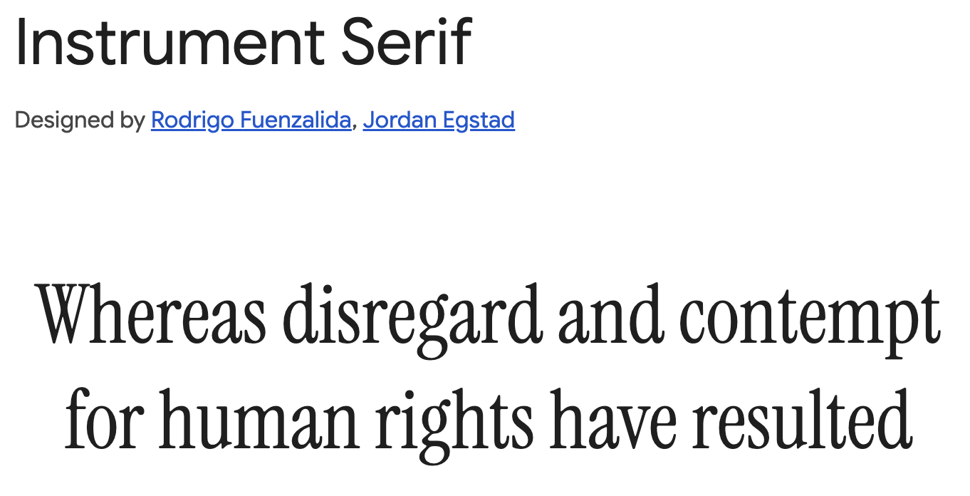
Upgrade your type game by choosing custom fonts.
A few examples of pairings that aren't overused:
• Display: Instrument Serif or Cabinet Grotesk
• Body: Geist or Switzer
Typography details that matter:
• Increase line height to 1.6 or 1.7 for body text (not Tailwind's default 1.5)
• Use
• Vary font weights intentionally: 600 for headings, 400 for body, 500 for emphasized text
• Add
Inspiration: Check out Typewolf for real-world examples of type in action.
Upgrade your type game by choosing custom fonts.
A few examples of pairings that aren't overused:
• Display: Instrument Serif or Cabinet Grotesk
• Body: Geist or Switzer
Typography details that matter:
• Increase line height to 1.6 or 1.7 for body text (not Tailwind's default 1.5)
• Use
tracking-tight (-0.02em) for headings• Vary font weights intentionally: 600 for headings, 400 for body, 500 for emphasized text
• Add
max-width to text blocks: max-w-[65ch] for optimal readabilityInspiration: Check out Typewolf for real-world examples of type in action.
5. Color: Beyond the Default Palette
Tailwind's default colors are great, but when everyone uses blue-500 and purple-600, everything looks similar.
Create a custom palette:
• Use Realtime Colors to preview your color scheme in context
• Or try Huemint for AI-generated palettes that actually work together
• Study Happy Hues to see how colors work in complete layouts
Pro tip: Pick one unexpected accent color. Everyone uses blue or purple. What about:
• Warm orange (#FF6B35)
• Deep coral (#E63946)
• Forest green (#2D6A4F)
• Amber (#F59E0B)
6. Animation Libraries for Production-Quality Motion
CSS transitions are fine, but if you want your site to feel premium, you need better animation tools.
Framer Motion (if you're using React)
The industry standard for React animations. Use it for:
• Page transitions
• Scroll-triggered animations with
• Complex sequenced animations
GSAP (for more complex animations)
When Framer Motion isn't enough. Check out GSAP's showcase for inspiration.
Auto Animate
For simple list animations and transitions: Auto Animate by Formkit
Framer Motion (if you're using React)
The industry standard for React animations. Use it for:
• Page transitions
• Scroll-triggered animations with
whileInView• Complex sequenced animations
GSAP (for more complex animations)
When Framer Motion isn't enough. Check out GSAP's showcase for inspiration.
Auto Animate
For simple list animations and transitions: Auto Animate by Formkit
7. Study Real Products (Not Templates)
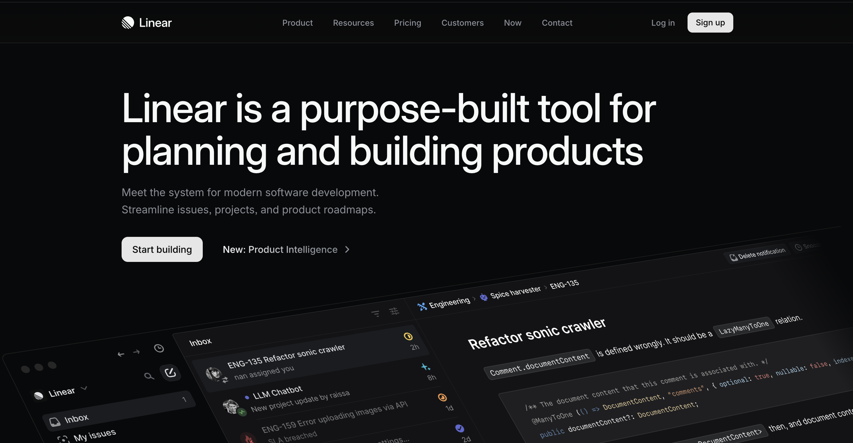
Here's where most "vibe coders" miss the mark: they study templates, not actual shipped products.
Sites to study closely:
• Linear: Notice how they use motion sparingly but meaningfully, the way content reveals on scroll, their use of transparency and blur
• Vercel: Subtle grid patterns in the background, how they handle code blocks and syntax highlighting
• Attio: Cards with subtle borders instead of heavy shadows, micro-interactions on every button and input
• Railway: Dark mode that doesn't feel heavy, accent colors used strategically
How to study them:
• Open DevTools (Inspect element)
• Look at their exact color values, spacing, and border-radius
• Notice timing functions for animations (ease-out, cubic-bezier)
• Copy the patterns, not the exact design
8. The Details Checklist
Before you ship, audit these details:
Visual polish:
• Consistent border radius (pick 2-3 values, not random)
• Shadows have subtle color tints (not pure gray)
• Images have subtle overlays or borders
• Empty states are designed, not just "No items found"
• Error states are friendly and helpful
Interaction polish:
• All buttons have hover AND active states
• Focus states are visible (for keyboard users)
• Loading states exist for every async action
• Animations don't run on page load (annoying)
• Mobile interactions feel native (not desktop-squeezed)
Typography polish:
• Headings have proper hierarchy (not all the same size)
• Line length is controlled (not full-width on desktop)
• Letter spacing is adjusted for headings
• Text color has sufficient contrast
The Real Secret: Constraint
Here's what separates professional-looking sites from AI slop: constraint.
• Use fewer colors (2-3 max, plus grays)
• Use fewer font sizes (5-6 max)
• Use fewer animation types (pick 2-3 patterns and stick to them)
• Use fewer components (one button style, not five)
When AI generates code, it often creates variety for variety's sake. Professional design is about making deliberate choices and applying them consistently.
Your Next Steps
You don't need to implement all of this at once. Here's a priority order:
Week 1: Foundation
1. Replace gradient background with something more subtle
2. Implement the sticky header shadow effect
3. Add one premium component library (start with Aceternity)
Week 2: Polish
4. Audit and fix all button states (hover, active, focus)
5. Add micro-interactions to 3-5 key elements
6. Improve typography (font pairing + line height + width)
Week 3: Refinement
7. Study one site from the list above deeply
8. Implement one complex animation with Framer Motion
9. Go through the details checklist
Remember: You're Not Starting from Zero
The biggest advantage you have as a vibe coder? Your AI tool already handles the hard parts—the logic, the structure, the functionality. You're not fighting webpack configs or debugging CORS errors.
You're just adding the 10% of polish that transforms "this works" into "I'd pay for this."
The difference between amateur and professional isn't technical skill—it's attention to detail and knowing which details matter.
Now go make something beautiful.
Want to maintain ownership of your code as you scale? Differ helps vibe coders store, understand, and collaborate on their projects without Git complexity. Because you shouldn't have to choose between building fast and staying in control.